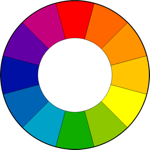
Color is used everywhere, so it is important to know how to use it properly. The way color is used can completely transform an image and change how it is interpreted. Using two colors that are opposite from each other on the color spectrum brings the focus onto the color that stands out, whereas using analogous colors causes the image to blend together. This article will explain how you can use colors to your advantage in creating content.
Contrasting Colors

When you look at this image, your eye likely goes directly to the yellow crayon. Using color in this way is effective when you want to bring the viewer’s attention to something. In films, directors sometimes will place characters in clothes that contrast from the background to make sure they stand out. This is also used when creating graphics or presentations to make text pop and seem more interesting.
Analogous Colors

In this image of crayons, the colors are all in the same family, causing them to blend in. Your eye probably didn’t get drawn to a particular crayon, and the overall image seems a bit bland. But analogous colors can still be impactful when setting a mood.
Colors are often associated with different moods or feelings, such as red with anger, blue with sadness, and yellow with joy. So, when a movie setting is filled with blue, it emphasizes that what is happening is sad.
The How-To
Now that we have established the different types of colors and when to use them, it is time to discuss how. Here is a quick guideline to help you create a vibrant (or not vibrant) image once you have an idea of what you want to create:
- Figure out the mood
I think this is the most important step because the mood changes the entire image. The mood can be changed by simply altering the angle of the photo taken, which is why you need to establish the tone you want to convey first. Then, you can research which colors will help you achieve this.
- Decide what to emphasize
Now that you have the mood, you need to decide what the focal point will be, if there is one. As stated earlier, the easiest way to direct the focus of an image is to utilize contrasting colors. Place the subject in the opposite color of the background to make them pop or use the same color to make them blend in and highlight the mood.
- Consider the contrast
While contrast isn’t directly related to color choices, lighting and shadows can affect how the image is perceived. If the range between the lightest and darkest color on an image is high, the colors will be made more vibrant, whereas if the range is low, the colors will appear duller.
Finding the right colors to use can take your content to the next level. Now it’s your turn to start creating!


Leave a Reply